Revisiting Design: The RealityFragments Like/Comment Use Case

Yesterday, I went on a bit of a spree on RealityFragments.com, with the results fairly summarized on the RealityFragments About Page. The reason for the spree was pretty simple.

There are some issues with design.

Some of it is implicit in WordPress.com. To ‘like’ or ‘comment’ on content, you require a WordPress.com account. It’s painful for non-WordPress.com users to do that when they’re used to logging into everything automagically – and it’s also necessary to avoid spam comments that link to websites that sell everything from ‘getting rich quick’ schemes to promises of increasing the prominence of one’s nether regions. It’s a hard balance.

And it’s kinda crappy design because we, collectively, haven’t figured out a better way to handle spammers. I could get into the failures of nations to work together on this, but if we go down that path we will be in the weeds for a very, very long time.

Suffice to say my concern is that of the readers. The users. And it brought to mind that yellow book by Donald A. Norman, the very color of the book being an example of good design. After all, that’s how I remember it.

“Design is really an act of communication, which means having a deep understanding of the person with whom the designer is communicating.”

Donald A. Norman, The Design of Everyday Things (2013)

This is where we who have spent time in the code caves get things wrong. Software Engineers are generally rational beings who expect everyone to be rational, and if we just got rid of irrational users “we would have a lot less problems!”.

I’ve spent about half a century on the planet at this point, and I will make a statement: By default, humans are irrational, and even those of us who consider ourselves rational are irrational in ways we… rationalize. Sooner or later, everyone comes to terms with this or dies very, very frustrated.

The problem I had is that I wasn’t getting feedback. The users can’t give it without giving WordPress.com the emotional equivalent of their first born child, apparently. Things have gotten faster and we want things more now-er. We all do. We want that instant gratification.

In the context of leaving a comment, if there are too many bells and whistles associated with doing it, the person forgets what they were going to comment about in the first place.

“The idea that a person is at fault when something goes wrong is deeply entrenched in society. That’s why we blame others and even ourselves… More and more often the blame is attributed to “human error.” The person involved can be fined, punished, or fired. Maybe training procedures are revised… But in my experience, human error usually is a result of poor design: it should be called system error. Humans err continually; it is an intrinsic part of our nature…. Worse, blaming the person without fixing the root, underlying cause does not fix the problem: the same error is likely to be repeated by someone else.”

Donald A. Norman, The Design of Everyday Things (2013)

The thing is – there is no good solution for this. None, whatsoever, mainly because the alternative that was already there had not occurred to the users. It’s posted on Facebook, on the RealityFragments page, where I mix content from here and RealityFragments. The posts can be easily interacted with on Facebook for those who use Facebook. Sure, it doesn’t show on the website, but that doesn’t matter as much to me as the interaction itself?

Factor in that it’s easy for my posts to get buried by Facebook algorithms, it becomes an issue as well.

Thus, I created the RealityFragments Group on Facebook. People join, they can wander into the group and discuss stuff asynchronously, instead of the doom scroll of content people are subjected to. My intention is for my content not to compete for attention in that way, because it simply can’t.

I don’t have images of models trying on ideas. I don’t have loads of kitten pictures, and I’m certainly not getting dressed up and do duck lips to try to convince people to read and interact with what I create. I am also, for the record, not willing to wear a bikini. You’re welcome.

This was less than ideal solution to the problem. Maybe.

Time will tell if I got it right, but many more technically minded people will say, “You could just manage your own content management system on a rented server.” This is absolutely true.

What’s also true is that I would then be on the hook for everything, and when a content management system needs love, it wants it now. Thus when I’m ready to start writing, I suddenly have to deal with administration issues and before you know it, I’ve forgotten what I wanted to write – just like the users that have to create an account on WordPress.com to comment or like. A mirror.

So this is a compromised solution. Maybe. Time will tell.

And if you want to interact with this post and can’t log in to WordPress, feel free to join the RealityFragments.com Facebook group. Despite it’s name, it’s also for KnowProSE.com

UX and SaaS (2013)

Dried Peppers

It’s old news that Flickr has updated its site. It’s old news that thousands of users don’t like it. After a solid week of using it I have to say that I don’t understand why people are griping so much.

This last update really works for me. I realize in the end that I may pay more for the Flickr service in the long term but I’ve got 17,210 pictures on Flickr at the time of this writing and I suppose I will eventually go over 20,000 images. That’s a lot of images (I plan to go through and delete some over time, particularly some of the less interesting ones). Is it the best service in the world for hosting images? I don’t know.

What I do know is that it does what I need it to do – and now it has made new photos from my contacts more engaging on the Flickr main page. This means that my images also get seen by my contacts more easily and, really, on a photo sharing site, visibility is king.

Am I in the majority? I don’t know. I do know when you update a service with live users, people get cranky. I’ve seen it with many services over the years and have seen updates that really suck. Flickr’s update, to date, has no down side that I’ve found.

Updating Services: The Ups and Downs.

Users are strange creatures when it comes to services. Users invest heavily in an emotional way in what they use; that’s the hook. In the context of Flickr, we users develop contacts and like it when people favorite or leave nice comments on our photos. It’s a pat on the back, an affirmation, a feel good moment. Sad is the photographer whose photos no one likes. I’ve never been extremely popular on the service because of a variety of reasons and I’m OK with that. The only person I’m really interested in being better at is me, but there are some competitive folks out there who take getting listed as an interesting photo quite seriously. They accumulate likes and favorites as if they were actual currency – and they’re not.

It’s typically that gaming element that has people complaining most about a service. In Second Life, it was about impacting how people made real currency. On Twitter, it’s about how many people retweet you. On Facebook, it’s about how many people like your page or like your posts or share your posts. The gamification, often heralded as a game-changer, is a double edged sword.

Aside from the popularity contest, there’s the user experience. UX is what they call that now because we humans like to abbreviate things and, in this case, ‘UX’ allows people who don’t do well with 4 syllable words a chance to discuss user experience – perhaps a dangerous thing if one thinks that through. Most people feel an emotional ownership of a service despite the fact that they don’t actually own the service. This ‘ownership’ creates brand/service loyalty but it also doesn’t react well to changes perceived as drastic even when the changes positively influence what users can do.

Change is difficult to swallow, not unlike a hot pepper. Mixed in with other things, change becomes more easy to swallow. It’s an issue of flavor and gauging the taste of the audience. Smart owners of services take the temperature on issues before they do so, allowing people to believe that they have an effect on the service they get (and reinforcing the false ownership) and that they matter – but the reality is that what people want also has to meet the criteria of the owner of the service. TANSTAAFL.

Every change that Facebook makes upsets people. Yet Facebook users still use it, even if only to complain about Facebook. The same can be said of any service. It boggles the mind at times what users will put up with despite their complaints. From the outside looking in, one has to wonder why people do put up with so much.

That’s where User Experience comes in.

HowTo: Twitter Header Size 2016

Storm

In the past, for Twitter, I just tossed one of my many beach sunrise photos at it and let it do it’s thing. This time, I didn’t.

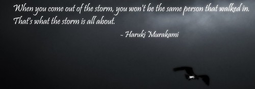
Yesterday I made the image on the right. There was a meme going around, and I had this picture of a North American Osprey in the forefront of a storm, and I thought – why not.

Then I was looking at my Twitter page and thought, “That might be a good header”. So I tried changing it and, lo, it was too big and didn’t resize right. So – I had the wrong dimensions, and through a search I found out that the Twitter header size is supposed to be 1500 x 500 pixels. I resized the image accordingly.

Same problem.

I tried Chrome and Firefox (I typically use Seamonkey). Same problem.

I did some more digging, tried a few different sizes. Still, no. Same problem. I tried for searching for things like, “Twitter header too big” and came up with the same awful pages that hadn’t helped me in the first place. Some offered to resize it for me, but tada – same problem.

I went from searching for the right answer to hacking my own.

It took me about 15 minutes (as long as it took to write this) to come up with the solution.

If you’re having a similar problem, try changing the canvas size such that you have 100 pixels above and below (add 200 pixels or so to the canvas size, centered, and there you go). Fill it with a similar color just in case.

Try it out. Tweak it if necessary. You’re done.

And a sidenote to Twitter – did you actually think about how screwy this is?